Introducing VJ18VF Typeface
The main goal of this typeface was to develop a bespoke display font for the brand, communication and merchandising materials of the 2018 edition of the international academic conference on sciences and arts of videogames. Using the Variable Font design space with two axes — width and weight — the result was the development of VJ18-VF. An all-caps, extra light, mono font inspired by the vector graphics of the 1979 Asteroids arcade game that was the motto for the briefing of the conference’s visual communication.

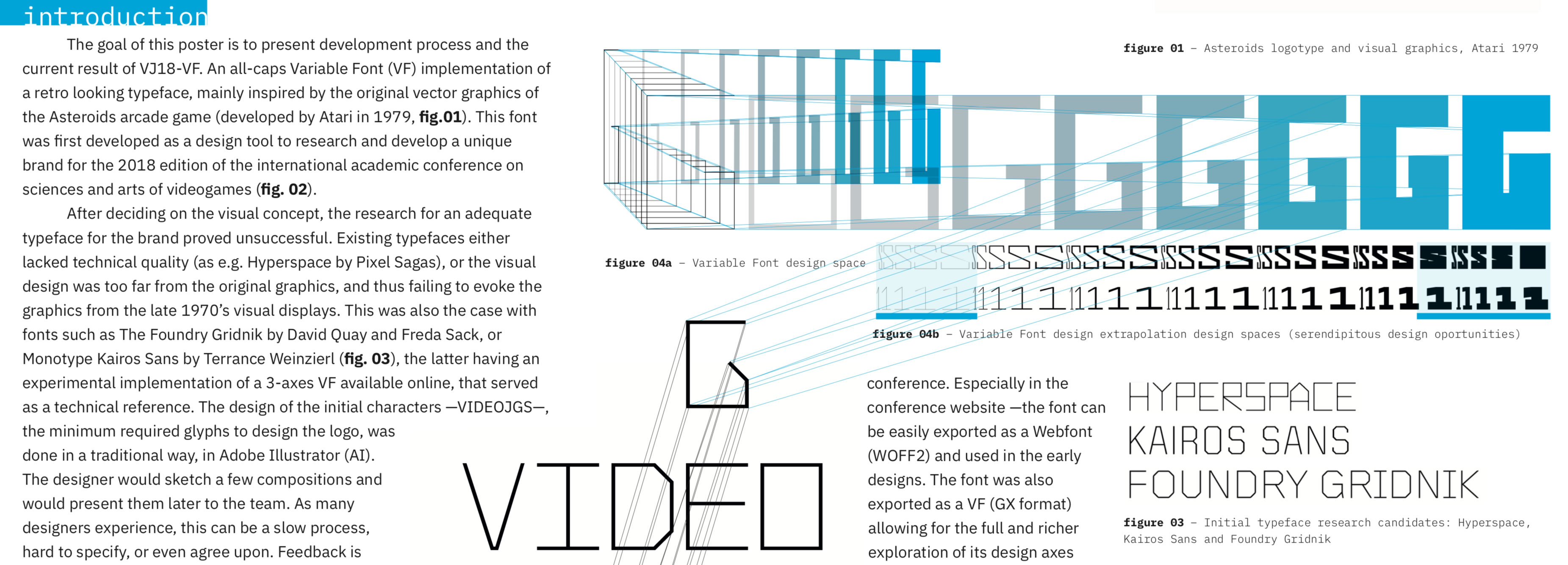
Concept & Inspiration
After deciding on the initial concept, the research for an adequate typeface for the brand proved unsuccessful. Existing typefaces either lacked technical quality (as e.g. Hyperspace by Pixel Sagas). Or, despite the quality, the visual design was too far from the original graphics, and thus failing to evoke the graphics from the late 1970’s visual displays (as e.g. fonts such as The Foundry Gridnik by David Quay and Freda Sack, or Monotype Kairos Sans by Terrance Weinzierl). The new font was designed then designed to Evoque the visual terminals of the ‘70s. And its fixed proportions (600 em units) were set to fit with the proportions of the IBM Plex Mono (by Mike Abbink and Bold Monday), as the supporting typeface for the text and communication. The drawings were therefore always compared and validated in real-time within its final usage communication media.
One Font File (yet)
Although the end result is just one weight, working with a two axes design space allowed for some serendipitous exploration of the glyphs proportions by extrapolating beyond the set limits of instances. This allowed for the discovery of a much thinner weight (30 em units) than anticipated in the static design (50 em units). And a much faster exploration of the design space of the logo with the team, e.g. exploring alternative glyph shapes for some key characters such as the “G”.
The typeface is still undergoing development. A future "true" variable font will be released with major improvements (axes, drawing details, alternates, minuscules, etc.)
Stay tunned! ;)
Exhibitions
This font (and the descrition of its process within a larger branding program) was presented at the 9th edition of the Typography Meeting international conference, held in 2018 at Tomar. It will be featured in the proceedings soon.